A Comprehensive Guide to Elevating Your Brand
Your website’s color palette is one of the most critical elements of your brand identity. It’s not just about aesthetics—it’s about creating an emotional connection with your audience, guiding their experience, and ultimately driving action. But with endless color combinations and design trends, how do you choose the perfect palette that aligns with your brand and resonates with your audience?
In this guide, we’ll dive deep into the art and science of selecting a color palette for your website. You’ll learn actionable tips, discover how to implement a custom palette in Showit, and see why professional web design can make all the difference.
Why Your Website’s Color Palette Matters More Than You Think
Colors are powerful. They influence emotions, perceptions, and even decision-making. Here’s why your website’s color palette deserves careful consideration:
1. Brand Identity: Your colors are a visual representation of your brand’s personality. Are you bold and energetic? Soft and approachable? Professional and trustworthy? Your palette should reflect these traits.
2. User Experience: A well-chosen palette enhances readability, navigation, and overall usability. Poor color choices, on the other hand, can frustrate users and drive them away.
3. Conversion Optimization: Strategic use of color can draw attention to key elements like call-to-action buttons, forms, and links, directly impacting your conversion rates.
Actionable Tips to Choose the Perfect Color Palette
1. Understand Color Psychology
Colors evoke specific emotions and associations. Before choosing your palette, define your brand’s core values and personality. Here’s a quick breakdown of common color meanings:
– Blue: Trust, calm, professionalism (great for corporate brands).
– Green: Growth, health, nature (ideal for eco-friendly brands).
– Red: Energy, passion, urgency (perfect for bold, dynamic brands).
– Yellow: Optimism, creativity, warmth (works well for playful or innovative brands).
– Black: Luxury, sophistication, power (often used by high-end or minimalist brands).
2. Start with a Base Color
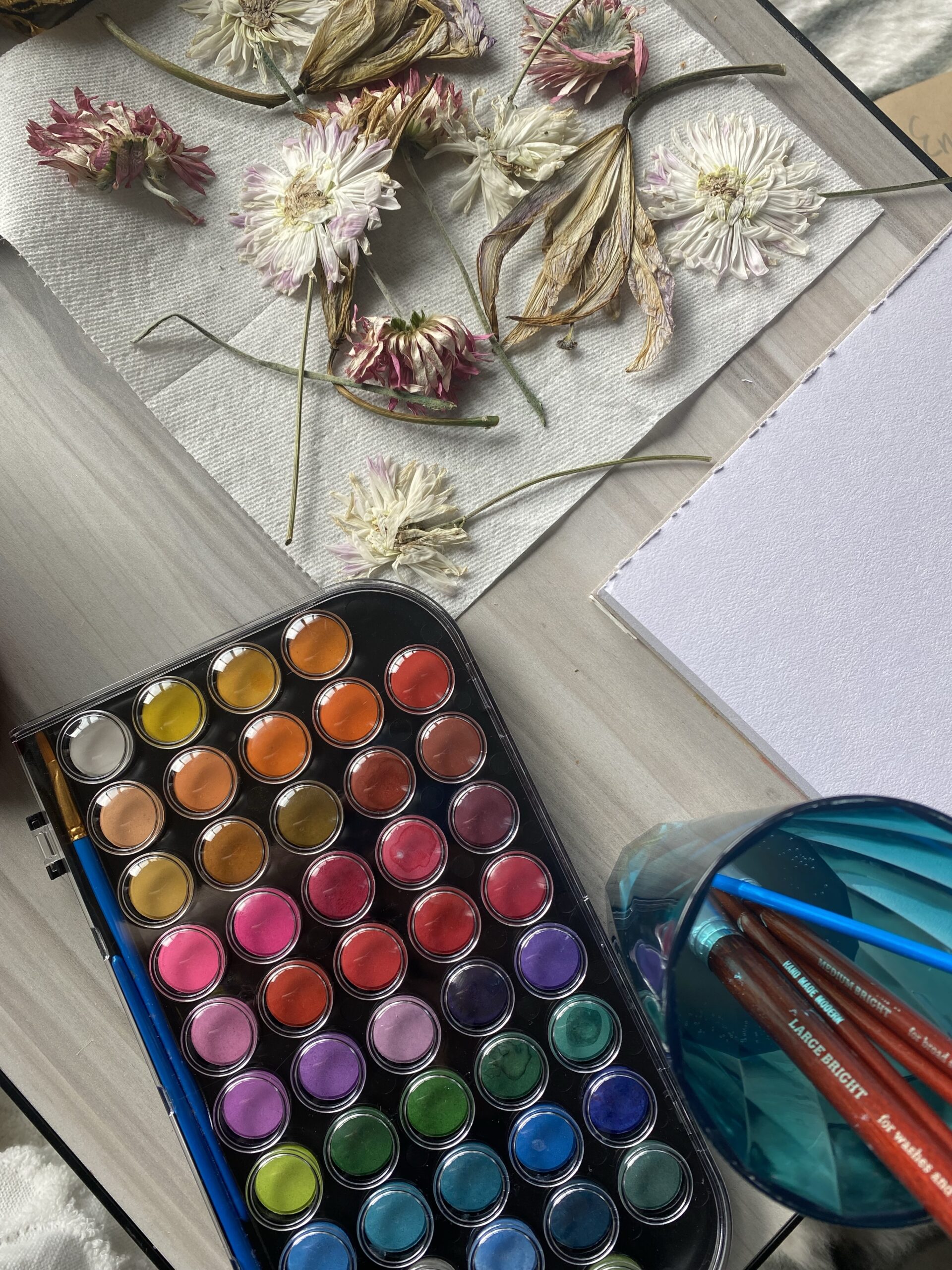
Your base color is the foundation of your palette. It’s typically the color most closely associated with your brand. If you already have a logo, start by pulling the dominant color from it. If you’re starting from scratch, use tools like Coolors or Adobe Color to experiment with shades and tones. Additionally, you could check my Brand Color Palettes Pinterest board for inspiration.
3. Use the 60-30-10 Rule for Balance
This timeless design principle ensures your palette feels cohesive and visually appealing:
– 60% Dominant Color: This is your main color, often used for backgrounds or large sections.
– 30% Secondary Color: This complements the dominant color and is used for headers, subheadings, or buttons.
– 10% Accent Color: This is your “pop” color, reserved for CTAs, highlights, or other elements you want to stand out.
For example, if your dominant color is a soft beige, your secondary color could be a muted green, and your accent color a vibrant coral.
4. Consider Contrast and Accessibility
A beautiful palette is useless if it’s not functional. Ensure your colors provide enough contrast for readability, especially for text and interactive elements. Use tools like WebAIM’s Contrast Checker to test your combinations.
Accessibility is also crucial. Approximately 1 in 12 men and 1 in 200 women have some form of color blindness. Avoid problematic combinations like red-green or blue-yellow, and always provide alternative cues (e.g., icons or underlines) for important information.
5. Draw Inspiration from Your Industry
Look at competitors or industry leaders for inspiration, but don’t copy—stand out while staying relevant. For example:
– Eco-Friendly Brands: Greens, browns, and earthy tones.
– Tech Companies: Blues, grays, and sleek metallics.
– Creative Agencies: Bold, vibrant palettes with unexpected combinations.
Ichigoods Tip: Create a mood board with colors, images, and textures that resonate with your brand. This can help you visualize how your palette will come to life.
How to Add a Custom Color Palette in Showit
Showit is a fantastic platform for creating visually stunning websites, and it makes implementing a custom color palette incredibly easy. Here’s a step-by-step guide:
1. Log in to Your Showit Account: Navigate to your website’s design dashboard.
2. Go to the Design Settings: Click on “Design” in the top menu, then select “Colors.”
3. Add Your Custom Colors: Click “Add Color” and input the HEX codes for your palette. You can create as many custom colors as you need.
4. Apply Colors to Elements: Use your custom palette to style text, buttons, backgrounds, and more. Showit’s drag-and-drop editor allows you to maintain consistency across your site effortlessly.
Why Professional Web Design Makes All the Difference
While DIY tools like Showit make it easier than ever to design a website, there’s no substitute for professional expertise. Here’s how working with a web designer can elevate your site:
1. Strategic Color Selection: A professional designer understands the nuances of color psychology and can create a palette that aligns perfectly with your brand and goals.
2. Custom Design: Off-the-shelf templates can only take you so far. A custom design ensures your website is unique and tailored to your audience.
3. Technical Optimization: From accessibility to responsive design, a pro ensures your site looks and functions flawlessly across all devices.
4. Time Savings: Designing a website is time-consuming. By outsourcing to a professional, you can focus on running your business while knowing your site is in good hands.
If you’re ready to take your website to the next level, I’d love to help. As a professional web designer, I specialize in creating stunning, user-friendly websites that reflect your brand and drive results. Let’s work together to bring your vision to life!
Ready to Create a Website That Wows?
Your website is often the first impression you make on potential customers. Don’t leave it to chance. By following the tips in this guide, you’ll be well on your way to choosing a color palette that resonates with your audience and elevates your brand.
And if you’re feeling overwhelmed or simply want a flawless, professional result, I’m here to help. Contact me today to learn more about my web design services and let’s create something amazing together.

