In my honest opinion, I’ve curated a list of the top 15 free web fonts available on Google Fonts that can truly elevate the essence of your brand. These fonts, all 100% free and open-source for commercial use, are handpicked to add a touch of sophistication to your brand’s visual identity.
This collection places a strong emphasis on typeface families, offering a diverse range of weights and styles crafted by renowned type designers and foundries.
Embrace these fonts, not just as letters on a screen, but as a vital element in sculpting a brand that exudes elegance and refinement. Let your brand speak volumes with these carefully chosen typefaces, ensuring a visual language that resonates with the essence of sophistication.
Why fonts are important
Selecting the appropriate typefaces is one of the most critical aspects of website and brand design. The usage of appropriate fonts can improve a website’s overall design and user experience. Here are a few of the factors that make selecting the appropriate typefaces so important:
Visual appeal: Making the correct font selections can elevate your website to new heights. Just look at brands like Dior and Chanel. These straightforward font selections appeal to a consumer that values elegance.
Conversion rates: Selecting the right font for crucial sections of your website will help to bring attention to the call-to-action, highlight important information, and ultimately make it easier for users to interact with your material.
Website readability: Make sure your website uses the right kind of fonts by selecting an easy-to-read typeface and using them consistently. It is more difficult for users to absorb the content on your website if you use scripts for text blocks.
Why Google Fonts Are So Popular
In the vast landscape of font repositories, why should designers and creators turn their attention to Google Fonts? Let’s delve into the reasons that make Google Fonts a standout choice for those seeking elegance, versatility, and a touch of design magic.
- Extensive Variety, All in One Place: Google Fonts houses a treasure trove of fonts, covering a wide spectrum of styles, moods, and languages. From timeless classics to trendy newcomers, the platform provides a one-stop-shop for designers seeking that perfect typeface.
- Free Access to Quality: One of the most compelling reasons to choose Google Fonts is the cost – or rather, the lack thereof. All the fonts available are free for both personal and commercial use. This democratization of design resources allows creators to access high-quality fonts without breaking the bank.
- Web-Friendly and Speedy: Google Fonts operates on a Content Delivery Network (CDN), ensuring that fonts load swiftly on websites. This speed is crucial for optimizing user experience and site performance, a factor not to be underestimated in today’s fast-paced digital landscape.
- Ease of Integration: Integrating Google Fonts into your project is a breeze. With just a snippet of code, designers can seamlessly incorporate chosen fonts into their websites or applications. This accessibility promotes a hassle-free design process, making it easier for creators to focus on bringing their visions to life.
- Constantly Updated and Improved: Google Fonts is a dynamic platform that evolves with design trends and user needs. Regularly updated and expanded, it ensures that designers have access to contemporary typefaces that align with the ever-changing landscape of digital design.
- Open Source Collaboration: Many Google Fonts are open source, allowing designers to modify and customize them to suit specific project requirements. This level of flexibility and collaboration fosters a sense of community within the design sphere.
4. Applying the Font Styles:
With the fonts linked, you can now apply them to your text elements using CSS. Refer to the Google Fonts documentation for specific styling instructions.
Customize font sizes, weights, and styles to match your design vision. Test different combinations to find the perfect balance.
The Best 15 Free Elegant Fonts
Now that we cover the important basics let’s dive in the curation of the best 15 free elegant fonts that you can find in Google Fonts.
1.Marcellus
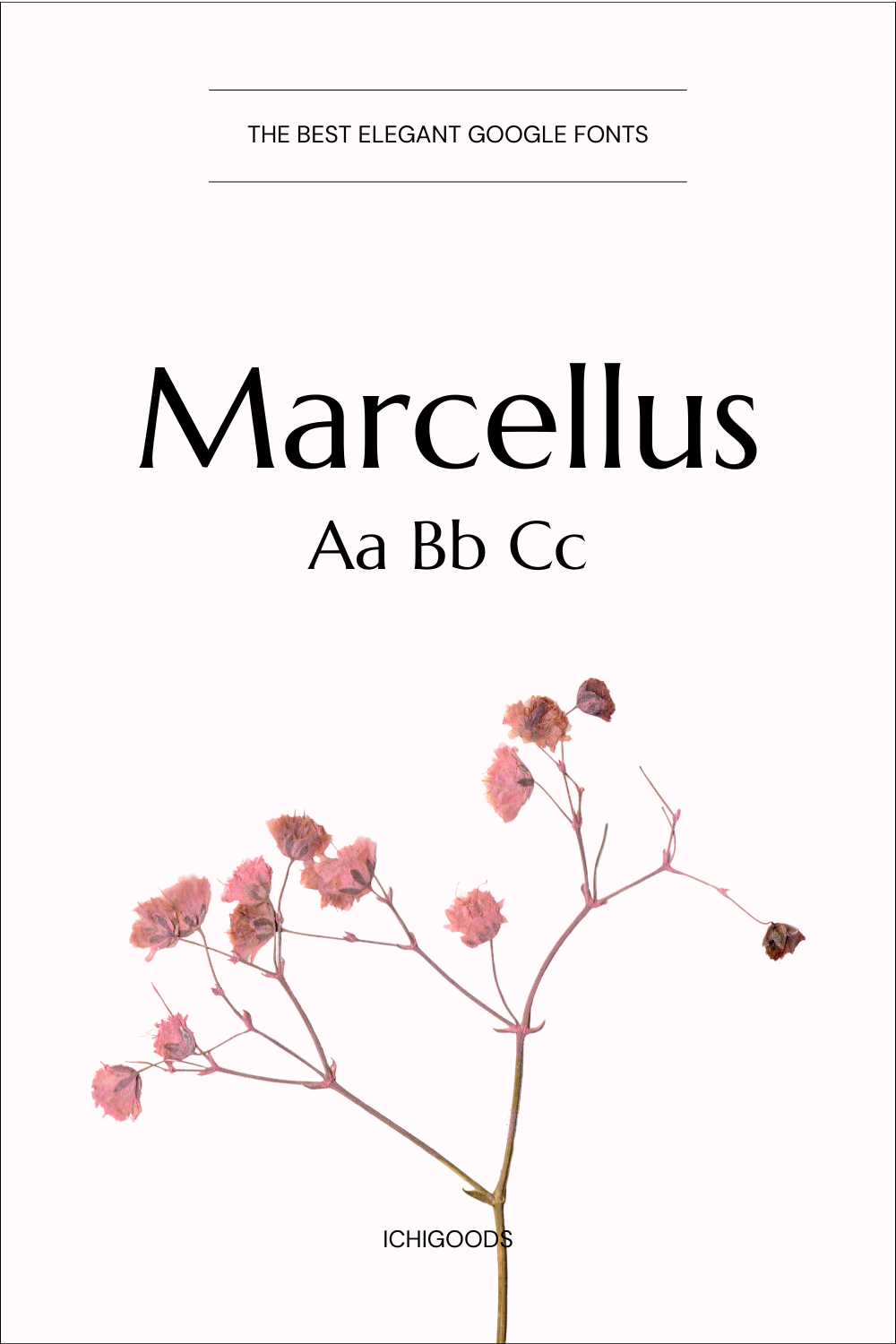
Marcellus is an elegant and versatile font that strikes a harmonious balance between classic sophistication and modern aesthetics. Designed with meticulous attention to detail, this typeface offers a distinctive charm that makes it suitable for various design applications. Here’s an overview of the key characteristics of the Marcellus font:
- Elegance and Refinement:
- Marcellus is synonymous with elegance. Its thin weight and ornate serifs convey a sense of refinement, making it an excellent choice for brands and projects that seek a touch of sophistication.
- Modern Aesthetic:
- Despite its classic elegance, Marcellus features a modern aesthetic. Clean lines and contemporary styling ensure that it seamlessly fits into contemporary design trends, making it relevant for a wide range of applications.
- Versatility in Design:
- Marcellus exhibits versatility in design, making it suitable for various purposes. From headlines and subheadlines to logos and branding elements, this font adapts effortlessly to different design contexts.
- Readability and Web-Friendliness:
- Originally crafted for newspaper and magazine headlines, Marcellus prioritizes readability. Its large x-height ensures clear visibility, especially in digital formats, making it well-suited for web applications.
- Unsuitable for Body Copy:
- While Marcellus excels in headlines and larger text, its thin weight makes it less suitable for body copy or small text. The delicacy of its lines might affect legibility in longer passages.
2. Baskerville

Baskerville, a font with a rich historical legacy, is a timeless classic that has stood the test of time since its creation in the 18th century. Crafted by the renowned English typographer John Baskerville, this serif typeface is characterized by its exceptional clarity, elegance, and balance. Here’s an overview of the key features that define the Baskerville font:
- Timeless Elegance:Baskerville exudes an enduring elegance that has made it a staple in print and digital design for centuries. Its refined and sophisticated appearance has cemented its status as a classic typeface.
- Serifs and Contrast:Characterized by sharp, high-contrast serifs, Baskerville achieves a distinctive look that enhances readability. The contrast between thick and thin strokes contributes to its visual appeal.
- Clear and Legible:Baskerville is celebrated for its exceptional clarity, making it highly legible in both print and digital formats. The careful attention to detail in letterforms ensures that each character is easily recognizable.
- Versatility:Baskerville’s versatility allows it to adapt to a wide range of design applications. From body text to headlines, it maintains a balanced and harmonious appearance, making it suitable for various contexts.
- Classic Book and Editorial Design:With its roots in 18th-century book design, Baskerville is a popular choice for classic book layouts and editorial design. Its clean lines and timeless aesthetic create an inviting reading experience.
- Digital Readability:Baskerville’s design elements, including a relatively large x-height and open counters, contribute to its readability on digital screens. This adaptability has ensured its continued relevance in the digital age.
3. Instrument

Instrument Serif, a commanding presence in the realm of bold and condensed display serif fonts, captivates attention with its narrower proportions. The deliberate design choice ensures a forceful impact in large-scale applications, seamlessly blending classic elegance with a distinct modern edge.
Here’s a comprehensive overview of the defining features that characterize the Instrument Serif font:
- Distinguishing Features:
- Serif Type: Elegant and sharp, the serifs exhibit subtle bracketing, contributing to a distinctive personality.
- Letterforms: Open and airy, the font features curved terminals and sharp diagonals, adding a dynamic touch.
- Overall Design: A harmonious fusion of classic and modern elements, resulting in a balanced and sophisticated aesthetic.
- Influences and Inspiration:
- Old-Style Serifs: Drawing inspiration from classics like Garamond and Baskerville, Instrument Serif infuses a contemporary, condensed feel into the timeless charm of old-style serifs.
- Art Deco Influence: Select letterforms showcase hints of Art Deco geometry and sharp lines, introducing subtle sophistication to the font’s structure.
- Modernism: Embracing a minimalist aesthetic with clean lines, Instrument Serif reflects a modern sensibility, ensuring its relevance and freshness.
- Brand Alignment:
- Sophistication and Precision: Instrument Serif seamlessly aligns with the brand’s dedication to quality and meticulous attention to detail, radiating sophistication and precision.
- Boldness and Innovation: The font’s confident personality mirrors the brand’s forward-thinking approach, embodying boldness and innovation.
- Timeless Appeal: Grounded in classic serif foundations, Instrument Serif exudes a timeless quality that resonates with the brand’s focus on enduring quality.
- Versatility:
- Limited for Body Text: Due to its condensed nature and high contrast, Instrument Serif is not the optimal choice for extended reading at smaller sizes.
- Strong in Specific Contexts: Thriving in branding, editorial design, posters, packaging, and contexts where impactful headlines and concise text are paramount.
- Digital Readability:
- Readability Considerations: While legible at larger sizes on screens, the font’s high contrast and condensed form may impact readability at smaller sizes or on low-resolution displays.
- Web Design Tips: For optimal web readability, use Instrument Serif sparingly for titles or large call-to-actions, ensuring ample padding and white space.
4. Darker Grotesque
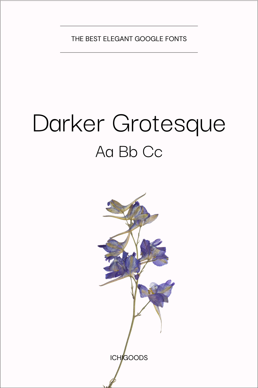
Darker Grotesque, a geometric sans-serif typeface, embodies a modern and minimalistic aesthetic with its clean lines and straightforward geometry. Its contemporary edge, sleekness, and minimalism make it a versatile choice for diverse design applications, spanning digital interfaces to print materials.
- Intended Use and Size:
- Versatile Usage: Darker Grotesque is designed with versatility in mind, seamlessly adapting to headlines, body text, and branding across various design projects.
- Optimal Sizes: Performing well across sizes, from small text details to large headlines, the typeface ensures both legibility and visual appeal.
- Influences and Inspiration:
- Modern Simplicity: Embracing the simplicity of modern design, Darker Grotesque aligns with current aesthetic preferences while maintaining a sense of sophistication.
- Digital Readiness: Focused on digital readability, Darker Grotesque ensures clear visibility on screens, catering to web design and electronic interfaces.
- Variants and Styles:
- Multiple Weights and Styles: Offering a range of weights and styles, Darker Grotesque provides designers with versatile options for varied purposes, from bold statements to subtle body text.
- Adaptable Styles: The typeface’s spectrum of styles, ranging from light and airy to bold and impactful, enhances its adaptability.
- Brand Alignment:
- Contemporary Identity: Seamlessly aligning with brands seeking a contemporary identity, Darker Grotesque is ideal for conveying a cutting-edge and forward-thinking image.
- Tech and Fashion Forward: Particularly resonant with technology and fashion brands, the typeface introduces a sleek and modern visual language to brand communication.
- Youthful Energy: Injecting a youthful and energetic vibe, Darker Grotesque is suitable for brands targeting a dynamic and trend-savvy audience.
- Digital Readability:
- Adaptability for Screens: Optimized for digital screens, Darker Grotesque guarantees clear and readable text in varying resolutions and sizes.
- Web Design Considerations: Suitable for web design, designers and entrepreneurs can confidently use Darker Grotesque for interfaces, headers, and other web elements without compromising readability.
5. Oranienbaum

Oranienbaum, a serif font categorized as an Antiqua, adheres to classical design principles, prioritizing high legibility for versatile applications.
- Intended Use and Size:
- Versatility: Oranienbaum thrives in both headlines and body text, offering impactful titles and readable captions.
- Influences and Inspiration:
- Classic Antiqua Roots: Inspired by historical Antiqua fonts like Bodoni and Garamond, Oranienbaum’s serif structure and proportions reflect timeless design principles.
- 20th-Century Modernism: Integrating elements from Art Deco and Bauhaus movements, the font embraces geometric forms and emphasizes legibility.
- Contemporary Twist: Updating the classic Antiqua style, Oranienbaum introduces clean lines and sharp details to align with modern design sensibilities.
- Variants and Styles:
- Currently One Weight: Presently available in a regular weight.
- Brand Alignment:
- Sophistication and Clarity: Oranienbaum’s clean lines and legibility make it an ideal choice for brands valuing precision and effective communication.
- Modern Heritage: Blending classic and contemporary elements, the font suits brands seeking a timeless yet relevant image.
- Versatility: Adaptable to diverse branding needs, excelling in both headlines and body text.
- Versatility:
- Excelling Contexts: Well-suited for print, digital, and editorial design, Oranienbaum offers a perfect balance of impact and readability.
- Broad Suitability: Adaptable to various design tasks, ranging from branding and advertising to editorial layouts and web design.
- Digital Readability:
- Screen Performance: Generally legible on screens, though considerations for high contrast should be made for very small sizes or low resolutions.
6. Pinyon Script
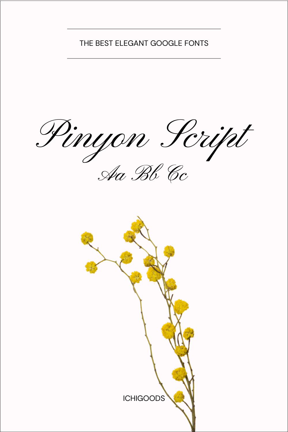
Pinyon Script is characterized by its graceful and flowing cursive design, bringing an air of sophistication to written text. The font features intricate details in each stroke, contributing to its overall charm and aesthetic appeal.
2. Intended Use and Size:
- Decorative Versatility: Pinyon Script excels in decorative applications, making it a go-to choice for invitations, cards, and projects where a touch of elegance is desired.
- Optimal Sizes: While suitable for various sizes, Pinyon Script shines in larger formats where its details can be fully appreciated.
3. Stylistic Nuances:
- Flourishes and Swirls: The font showcases delicate flourishes and swirls, adding a sense of playfulness and artistic flair to the script.
- Varied Line Thickness: Varied line thickness contributes to the organic and natural feel of Pinyon Script, enhancing its handwritten charm.
4. Versatility:
- Creative Applications: Pinyon Script is versatile, finding a place in creative projects, branding, and anywhere a touch of handcrafted elegance is desired.
- Warm and Inviting: The script’s warm and inviting nature makes it suitable for conveying a sense of friendliness and personal touch.
5. Digital Readability:
- Optimized for Display: While primarily designed for display purposes, Pinyon Script maintains readability on screens, making it suitable for digital invitations and graphics. If you want to use Pinyon in your web project I would highly recommend to use it only for headlines or decorative elements.
- Considerations for Size: Due to its intricate details, it is recommended to use Pinyon Script at sizes where the nuances of the script can be appreciated without sacrificing legibility.
7. Crimson

Crimson, a serif font deeply rooted in the tradition of classic typefaces, presents a timeless and refined aesthetic. Known for its exceptional clarity, Crimson prioritizes legibility through well-defined letterforms and meticulously crafted serifs.
2. Intended Use and Size:
- Versatile Applications: Crimson’s versatility makes it suitable for a broad spectrum of applications, spanning body text, headlines, and editorial design.
- Optimal Sizes: Designed to maintain legibility across diverse sizes, Crimson performs exceptionally well in both small text and large display settings.
3. Stylistic Nuances:
- Traditional Elegance: Crimson’s design emanates traditional elegance, positioning it as an excellent choice for projects that demand a sense of sophistication.
- Modern Details: While firmly rooted in tradition, Crimson seamlessly incorporates modern details, ensuring relevance in contemporary design contexts.
5. Brand Alignment:
- Timeless Appeal: Crimson aligns seamlessly with brands aspiring for a timeless and enduring visual identity, reflecting a commitment to quality and tradition.
- Professional Aesthetic: The font’s professional aesthetic makes it well-suited for corporate branding and editorial projects where a polished appearance is essential.
6. Versatility:
- Print and Digital Harmony: Crimson effortlessly transitions between print and digital environments, maintaining its visual appeal across various mediums.
- Editorial Excellence: Particularly well-suited for editorial design, Crimson excels in conveying information with clarity and style in newspapers, magazines, and books.
7. Digital Readability:
- Adaptability for Screens: Designed with digital readability in mind, Crimson ensures clear visibility on screens, making it a practical choice for web design and electronic media.
- Web Design Tips: To optimize Crimson’s readability in web design applications, use appropriate font sizes and spacing.
8. Libre Caslon Display

Libre Caslon Display, a member of the serif family, seamlessly combines classic serif elements with a contemporary twist, resulting in a refined and sophisticated appearance. Notable for its distinctive details, Libre Caslon Display exhibits nuanced letterforms that contribute to its unique and memorable character.
2. Intended Use and Size:
- Display Excellence: Tailored specifically for display purposes, Libre Caslon Display excels in making a bold visual statement in headlines, titles, and other prominent design elements.
- Optimized for Impact: The font performs optimally at larger sizes, allowing designers to leverage its visual impact for maximum effect in various display applications.
3. Stylistic Nuances:
- Contemporary Flourishes: Libre Caslon Display seamlessly blends traditional serif elegance with contemporary flourishes, resulting in a design that is both timeless and modern.
- Versatile Aesthetics: The font’s versatility allows it to adapt to diverse design styles, offering flexibility in creative expression.
5. Brand Alignment:
- Modern Elegance: Libre Caslon Display aligns well with brands seeking a modern and elegant identity, conveying sophistication and contemporary flair.
- Visual Consistency: The font’s consistency in style makes it suitable for reinforcing brand aesthetics across various design collateral.
6. Versatility:
- Display Design Domains: Excelling in display design realms, Libre Caslon Display is a go-to choice for projects requiring a distinctive and impactful typographic presence.
- Artistic Expression: The font’s expressive qualities lend themselves to artistic and creative applications, allowing designers to experiment with its unique visual language.
7. Digital Readability:
- Clear Visibility on Screens: While primarily designed for print, Libre Caslon Display maintains clear visibility on digital screens, providing a seamless transition between print and digital platforms.
9. Belleza

Belleza, a member of the sans-serif family, embodies a clean and modern aesthetic with a focus on simplicity. While minimalist, Belleza carries an air of sophistication with nuanced details that elevate its overall design.
2. Intended Use and Size:
- Versatile Applications: Belleza is versatile, suitable for a range of applications from body text to headlines, offering adaptability in various design contexts.
- Balanced Performance: The font maintains a balanced performance across different sizes, ensuring consistent readability and visual appeal.
3. Stylistic Nuances:
- Understated Elegance: Belleza exudes understated elegance, relying on subtle details to convey a sense of refinement without compromising its modern simplicity.
- Contemporary Elements: Incorporates contemporary design elements, making Belleza relevant in a variety of modern design projects.
4. Variants and Styles:
- Multiple Weights: Belleza offers a range of weights, providing designers with flexibility to create visual hierarchies and emphasize key elements.
- Italic Styles: The inclusion of italic styles adds a dynamic touch, allowing for expressive and visually engaging typography.
5. Brand Alignment:
- Modern Appeal: Belleza aligns well with brands seeking a modern and clean visual identity, projecting an image of freshness and contemporary relevance.
6. Versatility:
- Multi-purpose Design: Belleza’s versatility makes it suitable for a broad range of design projects, from corporate materials to editorial layouts and digital interfaces.
- Visual Harmony: The font contributes to visual harmony in design compositions, allowing for seamless integration with diverse graphic elements.
7. Digital Readability:
- Optimized for Screens: Belleza is optimized for digital readability, making it a practical choice for web design, mobile interfaces, and electronic media.
10. Junge

“Junge” stands out as a serif font with delicate and understated serifs, imparting a modern and lightweight essence. Drawing inspiration from the grace of calligraphy, the font exhibits subtle imperfections and flowing strokes, adding personality and dynamism.
Noteworthy for its high contrast between thin strokes and serifs, “Junge” maintains legibility even at smaller sizes, making it adaptable for both headlines and body text. Boasting subtle variations in stroke thickness and nuanced ink traps, “Junge” adds depth and visual interest without compromising clarity.
3. Intended Use and Size:
- Versatile Display: While capable in body text, “Junge” truly flourishes in larger sizes, commanding attention in headlines, titles, and branding elements.
4. Variants and Styles:
- Single Weight Focus: Presently available in a regular weight, “Junge” contemplates future expansions with plans for additional weights, including bold and italic styles.
5. Brand Alignment:
- Sophisticated and Modern: “Junge” aligns seamlessly with brands aspiring for a contemporary and refined image.
- Emphasis on Clarity: The font’s clean lines and high legibility make it a prime choice for brands valuing clear and effective communication.
- Versatility Across Industries: Adaptable across diverse industries, from tech startups to creative agencies to luxury brands.
6. Versatility:
- Editorial Excellence: “Junge” excels in editorial design, branding materials, posters, and packaging, showcasing strength in impactful visual communication.
- Considerations for Reading: While less suitable for extended reading due to its condensed nature, it remains a versatile asset for strategic design choices.
7. Digital Readability:
- Screen Readability: The font ensures good readability on various digital screens, thanks to its high contrast and open letterforms.
- Considerations for Small Sizes: At very small sizes or low resolutions, careful attention may be needed due to the thin strokes.
8. User Experience:
- Confident Impact: “Junge” aims for a user experience marked by confidence and impact through its refined design and strong visual presence.
- Strategic Implementation: Encourages users to strategically leverage the font’s strengths for headlines and key information while considering size limitations for extended text.
11. Cormorant

Cormorant boasts timeless elegance with its serif design, offering a classic aesthetic that transcends trends. Designed with a focus on legibility, Cormorant maintains readability across various sizes and applications.
3. Intended Use and Size:
- Versatile Applications: Cormorant is well-suited for a range of applications, from body text to headlines, making it adaptable for different design contexts.
- Balanced Performance: The font maintains a balanced performance across different sizes, ensuring clarity and visual appeal.
4. Variants and Styles:
- Multiple Weights and Styles: Cormorant comes in various weights and styles, providing designers with flexibility for creating visual hierarchies and emphasizing key elements.
- Italic Variations: The inclusion of italic styles adds a dynamic touch, allowing for expressive and visually engaging typography.
5. Brand Alignment:
- Timeless Appeal: Cormorant aligns well with brands seeking a timeless and classic visual identity, projecting a sense of enduring quality.
- Professional Aesthetic: The font’s clean lines and balanced proportions make it suitable for brands aiming for a professional and polished aesthetic.
6. Versatility:
- Multi-purpose Design: Cormorant’s versatility makes it suitable for a broad range of design projects, from traditional print materials to modern digital interfaces.
- Adaptable Aesthetics: The font seamlessly adapts to various design styles, allowing for creative expression while maintaining a cohesive visual identity.
8. User Experience:
- Clear Communication: Cormorant enhances user experience by facilitating clear and effective communication through its legible and well-balanced design.
- Accessibility: The font’s emphasis on legibility contributes to an accessible design suitable for various audiences.
12. Gilda
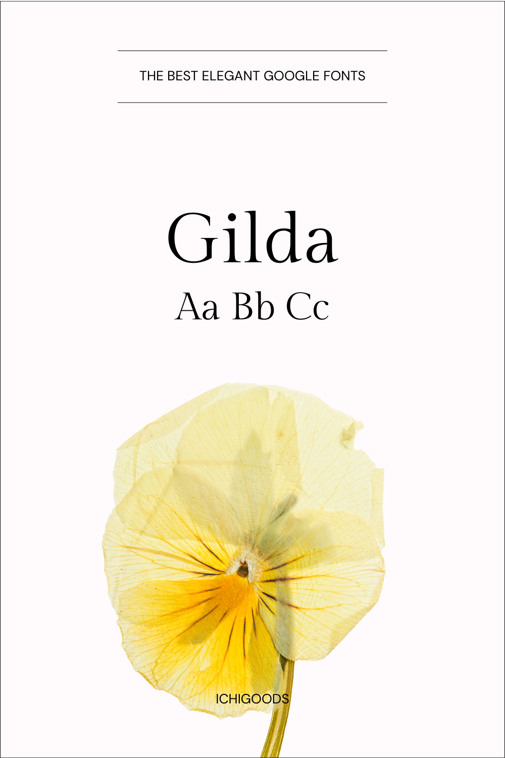
“Gilda” features a delightful dancing baseline, mirroring the natural rhythm of handwriting and infusing the font with dynamic flair. Embracing a friendly tone, letters in “Gilda” often connect, contributing to its informal and approachable feel.
3. Intended Use and Size:
- Primarily for Display: “Gilda” finds its spotlight in headlines, titles, logos, invitations, and branding materials, where its expressive nature can captivate.
- Size Performance: The font excels at larger sizes (36px and above), showcasing its details and personality effectively.
4. Variants and Styles:
- Single Style Currently: As of now, “Gilda” is available in a single regular weight.
5. Brand Alignment:
- Playful and Approachable: Ideal for brands targeting a younger audience or those aiming for a friendly and informal tone.
- Creative and Artistic: Aligns seamlessly with brands in arts, crafts, lifestyle, and entertainment sectors, infusing creativity and personal touch.
- Versatile Across Aesthetics: While adaptable to various styles, “Gilda” thrives in brands embracing a casual and personal aesthetic.
6. Versatility:
- Limited for Body Text: Suited for short bursts of text, invitations, greetings, and branding elements, “Gilda” may not be ideal for extended reading due to its casual nature.
- Exceling in Specific Contexts: Thrives in contexts where a personal and expressive touch is needed, making it perfect for impactful design elements.
7. Digital Readability:
- Readability Considerations: While legible at large sizes on screens, connected letterforms and the dancing baseline may impact readability at smaller sizes or on low-resolution displays.
- Web Design Tips: Best used sparingly for headlines, ensuring adequate padding and font size for optimal screen readability.
8. User Experience:
- Informal and Personal: “Gilda” aims to create a warm and friendly user experience, inviting users to connect with its natural flow and handcrafted feel.
- Strategic Use Encouraged: Designers are encouraged to strategically leverage “Gilda” in specific design elements, considering its impact and being mindful of size limitations, especially in digital applications.
13. Forum

“Forum” prioritizes accessibility, ensuring high legibility for users with visual impairments. The font’s name reflects its intended use for public spaces and communication, embodying an open and readable nature.
1. Design Characteristics:
- Classification: “Forum” is a sans-serif font with distinctive geometric shapes and sharp terminals, providing it with a unique and modern personality.
- Stylistic Features:
- High Legibility: Open letterforms and consistent spacing ensure excellent readability at both large and small sizes.
- Geometric Precision: Straight lines and circular shapes contribute to a modern and minimalist feel.
- Subtle Variations: Slight imperfections and rounded corners in letterforms like “o” and “e” add a touch of personality without compromising clarity.
- Inspirations: Drawing inspiration from classic geometric sans-serif fonts like Futura and Avant Garde, “Forum” adds a contemporary twist to its design.
3. Intended Use and Size:
- Versatility: “Forum” excels in both body text and display applications, suitable for extended reading as well as impactful headlines and branding.
- Size Performance: Optimal readability spans from 16px for body text to 48px and above for display purposes.
4. Variants and Styles:
- Multiple Weights: Currently available in four weights – Regular, Light, Medium, and Bold, offering flexibility in adjusting the font’s impact within a design project.
- Additional Variations: While no current plans for italic styles or other variations exist, the existing weight range provides ample versatility.
5. Brand Alignment:
- Modern and Professional: “Forum” aligns seamlessly with brands seeking a contemporary and sophisticated image.
- Clarity and Communication: High legibility and clean lines make it an ideal choice for brands prioritizing clear and effective communication.
- Adaptability Across Industries: Suited for diverse brands, from tech startups to creative agencies to educational institutions.
6. Versatility:
- Suitable for Various Design Applications: An excellent choice for branding materials, editorial design, websites, packaging, and any application requiring a modern and legible typeface.
- Contexts Where It Excels: Headlines, body text, logos, web interfaces, and user interfaces.
7. Digital Readability:
- Excellent on Screens: Clear letterforms and consistent spacing ensure good readability on all types of digital screens.
- No Specific Digital Design Considerations: Performs well without requiring special adjustments for optimal digital use.
14. Italiana
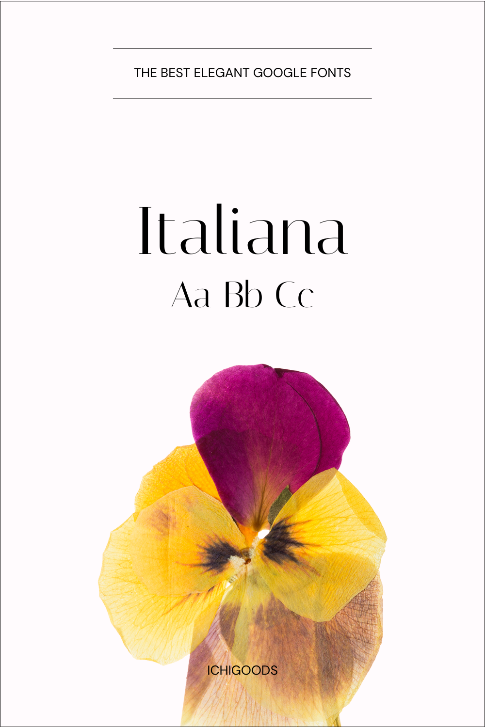
Italiana aims to provide a user experience that transcends trends, offering a timeless and enduring quality in design projects. Designers are encouraged to strategically use Italiana to enhance the visual identity and overall impact of their projects.
2. Design Characteristics:
- Classification: Italiana is a serif typeface, characterized by classical and timeless design elements.
- Stylistic Features:
- Elegance: Italiana exudes a sense of classical elegance with its carefully crafted serifs and letterforms.
- Versatility: The font strikes a balance between traditional and modern, making it suitable for various design contexts.
- Legibility: Clear and well-defined letterforms contribute to excellent readability across different sizes.
3. Intended Use and Size:
- Versatility: Italiana is a versatile typeface suitable for both body text and display applications.
- Size Performance: Performs admirably at a range of sizes, from small text to larger headlines, maintaining its elegance and legibility.
4. Variants and Styles:
- Multiple Weights: Italiana is available in various weights, providing flexibility for designers to adapt its visual weight to different design requirements.
- Italic Styles: The typeface typically includes italic styles, offering additional options for designers.
5. Brand Alignment:
- Timeless Aesthetic: Italiana aligns well with brands seeking a timeless and classical aesthetic.
- Elegance and Refinement: Ideal for brands that emphasize elegance, sophistication, and a touch of classical refinement.
- Cross-Industry Appeal: Suited for a diverse range of brands, from luxury goods to editorial publications.
6. Versatility:
- Adaptable Design Applications: Italiana is suitable for various design applications, including editorial design, branding, and web interfaces.
- Contexts Where It Excels: Body text in books or articles, as well as headlines and titles that require a touch of classical elegance.
7. Digital Readability:
- Excellent on Screens: Italiana maintains readability on digital screens, with clear letterforms that translate well across various devices.
- Web Design Considerations: Suitable for web design, ensuring a pleasing reading experience in online content.
15. Lora

Lora was designed by Olga Karpushina, a talented type designer renowned for her work in creating versatile and elegant typefaces. Initially developed by Karpushina and later released under the Google Fonts library, Lora is widely accessible for a diverse audience.
Design Characteristics:
- Classification: Lora is a serif font, showcasing timeless elegance and contemporary design elements.
- Stylistic Features:
- High Legibility: Open letterforms and balanced spacing contribute to exceptional readability.
- Traditional Roots with Modern Twist: Combining classic serif characteristics with modern design aesthetics.
Intended Use and Size:
- Versatility: Lora is versatile, suitable for both body text and display applications. Its balanced design allows it to shine in various contexts.
- Size Performance: Performs well across a range of sizes, with optimal readability for body text at smaller sizes and impactful presence in larger displays.
Variants and Styles:
- Multiple Weights: Lora offers multiple weights, providing flexibility in adjusting visual weight within design projects.
- Italic Styles: Italic variants are available, enhancing the font’s versatility and design possibilities.
Brand Alignment:
- Classic and Modern Fusion: Lora aligns well with brands seeking a fusion of classic sophistication and modern sensibilities.
- Emphasis on Elegance: Ideal for brands that prioritize an elegant and refined image with a touch of contemporary flair.
Versatility:
- Adaptable Applications: Well-suited for a range of design applications, including editorial design, branding, websites, and print materials.
- Contexts of Excellence: Lora excels in body text for readability and headlines for a touch of timeless elegance.
Digital Readability:
- Excellent on Screens: Lora’s open design and balanced letterforms ensure excellent readability on digital screens.
- Web Design Considerations: Performs well in web design, providing a pleasant reading experience for online audiences.
User Experience:
- Classic Elegance: Lora aims to deliver a user experience characterized by classic elegance, making it suitable for a variety of design projects.
- Strategic Use: Encourage users to strategically implement Lora in both body text and headlines to leverage its versatility.
Ready to Take the Next Step?
If you’re tired of a website that’s underperforming, let’s work together to create a digital masterpiece. Contact me today and let’s discuss how I can help your business thrive online!
